

In this post, I will share how I develop webcomponent using stenciljs.
Table of contents
Open Table of contents
So what we building?
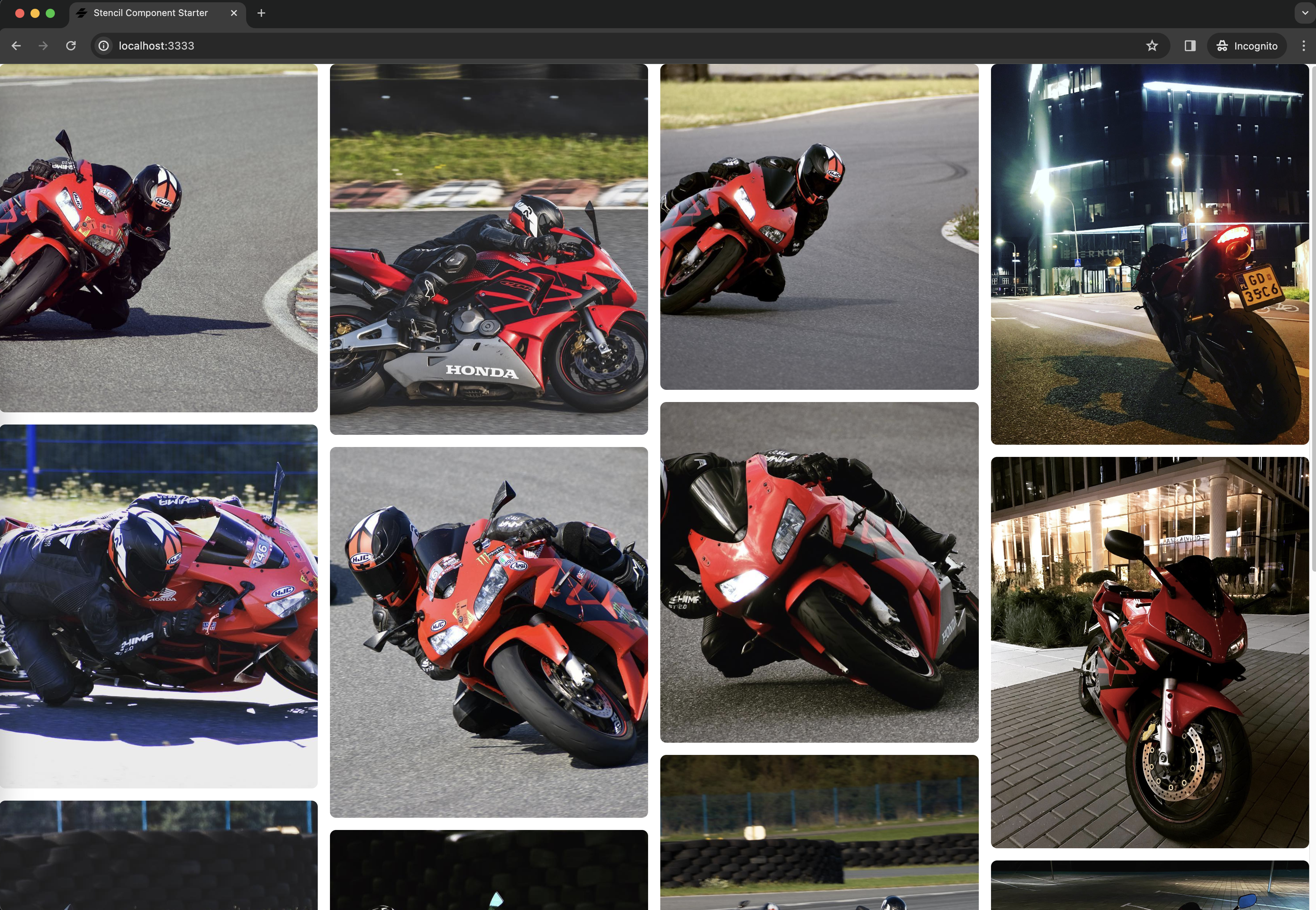
We will be creating a simple web component that displays our Instagram photos in masonry grid. This component can be utilized in any project.
Preparation
First we need get our token to instagram account. We can do it by using this tutorial.
What is stenciljs?
Stencil.js is a library that enables you to create fast, scalable user interface components compatible with the Custom Elements API. Developed by the Ionic team, it allows you to create components that can be used universally.
Stencil uses TypeScript for creating components and also offers features such as lazy loading, server-side rendering (SSR), code optimization, and many others.
It’s an excellent tool for creating component libraries that can be used in various projects and applications.
Getting started
Create a new project by
yarn create stencil
Enhance the StencilJS CLI by implementing a prompt that allows users to precisely specify their needs. When initiating a new project or component, the CLI should present options to choose between creating a standalone component or an entire application.
? Select a starter project.

Starters marked as [community] are developed by the Stencil
Community, rather than Ionic. For more information on the
Stencil Community, please see github.com/stencil-community

❯   component                Collection of web components that can be
                             used anywhere
    app [community]          Minimal starter for building a Stencil
                             app or website
    ionic-pwa [community]    Ionic PWA starter with tabs layout and routes
    ```
and this is our folder structure after installation

after run command yarn start we can see our component in browser.
Create component
At the beginning, I will create a component that displays our Instagram photos. We can do this by using the command
yarn stencil generate instagram-feed
For quick reference, I will paste the code of my component.
import { Component, Host, Prop, h } from '@stencil/core';

@Component({
  tag: 'instagram-feed',
  styleUrl: 'instagram-feed.css',
  shadow: true,
})
export class InstagramFeed {
  @Prop() token: string;

  private getToken(): string {
    return this.token;
  }
  render() {
    return (
      <Host>
        <div>{this.getToken()}</div>
        <slot></slot>
      </Host>
    );
  }
}
Create API Service
We need to create an API service to fetch our photos from Instagram. This can be done by using the Fetch API.
In the src folder, we need to create a folder service, and inside it, we need to create a file index.ts.
export const URL =
  "https://graph.instagram.com/me/media?fields=id,caption,media_url,media_type&access_token=";

class API {
  async getData(token: string) {
    try {
      const request = await fetch(`${URL}${token}`, {
        method: "GET",

        headers: {
          "Content-Type": "application/json",
        },
      });
      const response = await request.json();
      return response;
    } catch (error) {
      console.error(error);
    }
  }
}

export const ApiService = new API();
Request Data from API
In our component, we need to make an API call using our API service. So we implement a private method fetchMedia, and we call it in the componentWillLoad method.
import { Component, Host, Prop, h, State } from '@stencil/core';
import { ApiService } from '../../service';

@Component({
  tag: 'instagram-feed',
  styleUrl: 'instagram-feed.css',
  shadow: true,
})
export class InstagramFeed {
  @State() media: Media[][] = [];
  @Prop() token: string;
  private getToken(): string {
    return this.token;
  }

  private fetchMedia = async () => {
    try {
      const request = await ApiService.getData(this.getToken());
      console.log(request);
    } catch (error) {
      console.log(error);
    }
  };

  componentDidLoad() {
    this.fetchMedia();
  }

  render() {
    return (
      <Host>
        <div>{this.getToken()}</div>
        <slot></slot>
      </Host>
    );
  }
}
When i run yarn start i can see in console my data from instagram.
Styles
So firstly, we should add styles to our component. We will use Tailwind CSS for that.
Tailwind is a CSS framework that, at its core, supplies utility classes to make styling much easier. Tailwind offers a lot of additional features as well and has become especially popular in the world of design systems.
yarn add --dev tailwindcss stencil-tailwind-plugin typescript
Next, we’ll need to configure the plugin in our stencil.config.ts file by importing tailwind and tailwindHMR from stencil-tailwind-plugin and adding them to our plugins array.
import { Config } from "@stencil/core";
import tailwind, { tailwindHMR } from "stencil-tailwind-plugin";

export const config: Config = {
  namespace: "instagram-feed",
  plugins: [tailwind(), tailwindHMR()],
  // …
};
After that, Tailwind CSS should be configured. We can add styles to our component.
Setting state
We need to set state for our component. We can do this by using the @State decorator, but before that, we should create a type for our data. So we should create folder called types and put this types in index.ts file. In my case, it will be this type.
//https://developers.facebook.com/docs/instagram-basic-display-api/reference/media
const InstagramMediaTypes = {
  IMAGE: "IMAGE",
  VIDEO: "VIDEO",
  CAROUSEL_ALBUM: "CAROUSEL_ALBUM",
};

export type MediaTypes = keyof typeof InstagramMediaTypes;

type Media = {
  id: string;
  caption: string;
  media_url: string;
  media_type: MediaTypes;
};
After we get our media from the fetchMedia method, we could set request.data to our state.
  private fetchMedia = async () => {
    try {
      const request = await ApiService.getData(this.getToken());

      if (request.data) {
        this.media = request.data;
      }
    } catch (error) {
      console.log(error);
    }
  };
Displaying data
We can display our data by creating another component called Instagram media. We can do this by using the command
yarn stencil generate instagram-media
import { Component, Prop, h } from '@stencil/core';
import { Media } from '../instagram-feed/instagram-feed';

@Component({
  tag: 'instagram-media',
})
export class InstagramMedia {
  @Prop() item: Media;

  render() {
    return <img class="h-full w--full object-cover rounded-lg" src={this.item.media_url} alt={this.item.caption} />;
  }
}
We will create a masonry grid for our media. So I will chunk the array of media into 3 items.
private chunkArray = (array: Media[], size: number) => {
  return array?.reduce<Media[][]>((chunkedArr, _, index) => {
    if (index % size === 0) {
      chunkedArr.push(array.slice(index, index + size));
    }
    return chunkedArr;
  }, []);
};
After implementing the chunkArray method, we can use it in our fetchMedia method.
private fetchMedia = async () => {
    try {
      const request = await ApiService.getData(this.getToken());

      this.media = this.chunkArray(
        request.data.filter((item: Media) => item.media_type === InstagramMediaTypes.IMAGE),
        3,
      );
    } catch (error) {
      console.log(error);
    }
  };
And we can add instagram-media component to the instagram-feed component
  render() {
    return (
      <Host>
        <div class="grid grid-cols-4 gap-4">
          {this.media.map(item => (
            <div class="grid gap-4">
              {item.map(item => (
                <instagram-media class="h-full w-full object-cover rounded-lg" item={item} key={item.id} />
              ))}
            </div>
          ))}
        </div>
      </Host>
    );
  }
and this is our result.
How to use our component?
If we want to use this component in our project, we need to build it first. We can do this by using the command
yarn build
<!doctype html>
<html dir="ltr" lang="en">
  <head>
    <meta charset="utf-8" />
    <meta name="viewport" content="width=device-width, initial-scale=1.0" />
    <title>Stencil Component Starter</title>

    <script type="module" src="/build/instagram-feed.esm.js"></script>
    <script nomodule src="/build/instagram-feed.js"></script>
  </head>
  <body>
    <instagram-feed token="tokenId"></instagram-feed>
  </body>
</html>
What’s next?
We could develop more features for our component. For example, we could add a button to load more photos. We could also add a search bar to search for photos by hashtag or create configuration for masonry.
Next we could upload this component to npm and use it in our project.
Summary
In this post, I showed you how to create a web component using StencilJS. I hope you enjoyed this post. If you have any questions, please write to me by email.